Page Weight

Introduction
The internet is growing at a rapid pace. Each new page brings with it a bespoke set of resources necessary to render its content, which is expensive as more computing resources are required. These bandwidth requests are competing with the computing resources of generative AI initiatives.
In the United States, the rapidly growing AI demand is poised to drive data center energy consumption to about 6% of the nation’s total electricity usage in 2026, adding further pressure on grid infrastructures and highlighting the urgent need for sustainable solutions to support continued AI advancement. These generative AI initiatives will in turn rapidly increase the size of the web. Statista estimates 149 zettabytes of internet content were created in 2024. In comparison, the years from 2010 to 2018 produced a combined 127.5 zettabytes.
In short, resources are becoming increasingly scarce and expensive. With Google now prioritising on-page elements, addressing the issue of page weight has become important. Reducing unnecessary bloat in websites not only enhances user experience and boosts conversions, but also supports sustainability efforts.
As highlighted in discussions about web performance in 2024, heavy websites contribute to inequalities in user access and responsiveness, particularly on lower-end devices, widening the “performance inequality gap.” Alex Russel’s series, The Performance Inequality Gap bring into sharp focus that some of the assumptions that are made on current device performance and capabilities may not be true, and that whilst that devices might be getting more and more powerful, that’s not true for everyone, and there’s a long tail of users who are negatively impacted by web pages with large payloads.
This growing disparity emphasizes the importance of lightweight, efficient web design to ensure equitable access and engagement for all users. Page weight matters, whether you’re experiencing a weak network connection at an inopportune moment or live in a market where access to the internet is charged by the megabyte, inflated page weight decreases the availability of information.
Page weight is an accessibility issue
Large page weight disproportionately affects users who cannot afford top end devices, and fast, high data usage cap connections.
Bloated pages mean that people without access to these have a more expensive, less performant experience of the web, and in extreme cases might even make a page practically unusable.
What is page weight?
Page weight is the byte size of a web page. The web has evolved massively since its birth, and page weight in 2024 isn’t just the HTML from the URL you arrive at. In nearly all cases, it involves the assets needed to load and display that page. Those assets include the following:
- The HTML that comes in the initial response from a server.
- Images and other media (video, audio, etc) that are embedded into the page.
- Cascading Style Sheets (CSS) for styling the page.
- JavaScript to provide interactivity and functionality.
- Third-Party resources, which can be one or more of the above, from other providers.
Every extra thing added to a web page increases the overall page weight, and every bit ultimately means more work and overhead for the browser in transmitting it across the network, processing, parsing and ultimately rendering and painting it on the screen for the user to consume and interact with.
Some forms of resources carry even greater overheads, especially JavaScript, which also needs to be compiled and executed. This also has a knock-on effect on both sustainability and conversion rates. The heavier a page is, the more carbon emissions and the least possibility of conversions on that page.
You can find out more about how page weight impacts carbon emissions in the Sustainability chapter.
There are various mitigations available to help manage page weight, and its overall effect on load times, but the stark reality is that more weight is always going to involve more work.
The weight effects can be divided into three main categories: storage, transmission, and rendering.
Storage
Every byte of a web page needs to be stored somewhere, and with the nature of how the web works, that usually means being stored in multiple locations
It starts with the web server itself. Pure storage space remains relatively small in cost per Gigabyte, depending on the type of storage. For example, Google’s cloud storage is somewhere between $0.02 and $0.03 per month in North America or $0.006 and $0.025 in Europe. Resources stored in memory on a web server versus on disk for faster access will ramp up in cost far faster than one that lives on disk.
There can be multiple copies of the same resource too, spread across a number of intermediate caches, and even spread across multiple data centers if a CDN when edge caching is employed.
The second part of the equation is these resources also need to be stored on the user’s device when they access a page. Lower-end devices, particularly mobile ones, may be far more restricted as to how much they can hold. Pushing large payloads can overwhelm storage capacity, pushing other valuable resources to be purged from the cache. This can lead to additional costs and performance hits when navigating to a new page that would have reused those resources.
Transmission
The first time you visit a site, all the resources need to be delivered across the internet to your device. Subsequent visits to the same URL, or even other URLs on the same site, might mean that some of the resources can be used from cache, but a significant amount might still need to be retrieved again across the network.
Not all network connections are equal everywhere, it could be a super-fast broadband connection with generous data limits, or it could be a metered, capped slow mobile connection.
So, it is best to think strategically. The bigger the page weight, the longer the transmission of resources will take, and those with slower mobile connections or low data limits will be hit the hardest, which may also affect business.
The best way to optimize the transmission of resources is by serving small resources. In case that is difficult to achieve, using resource hints (like preconnect and preload) and fetch priority can help with managing the order resources are loaded on page.
Rendering
Before a browser can paint the URL requested onto someone’s screen, it needs to gather and process those resources.
The greater the page weight, the longer it will take a browser to get and process all the parts needed, delaying the point where users can read and interact with the page.
Even after loading, excessive page weight can make a page slow to respond to interaction, as the browser is bogged down shuffling large resources.
Page weight by the numbers
The internet blossomed from a place of bare text to the rich, interactive landscape we know today by introducing new content types. Images introduced visual depth, Javascript enabled interactivity, and videos introduced new ways of storytelling.
Each of these technologies also brought more weight to their pages. Before the introduction of HTML 2.0 in 1995, the only asset to weight was HTML, Page weight dramatically increased when RFC 1866 introduced the <img> tag, In 1996, JavaScript stepped on the scale followed by libraries like JQuery a decade later, The first widely recognized single-application framework emerged in 2010 opening the door for JavaScript frameworks like Angular, React, Vue and others to come to market.
Each evolution of page functionality brings with it more weight and file types intended to improve performance while retaining functionality.
We have analyzed common file types, their occurrence and response size to better understand their application. This includes comparisons by device and page type.
File type requests for the median page
To understand the file types associated with page weight, we should look at file type requests for the 50th percentile of pages. This provides a baseline for the impact of each file type overall.
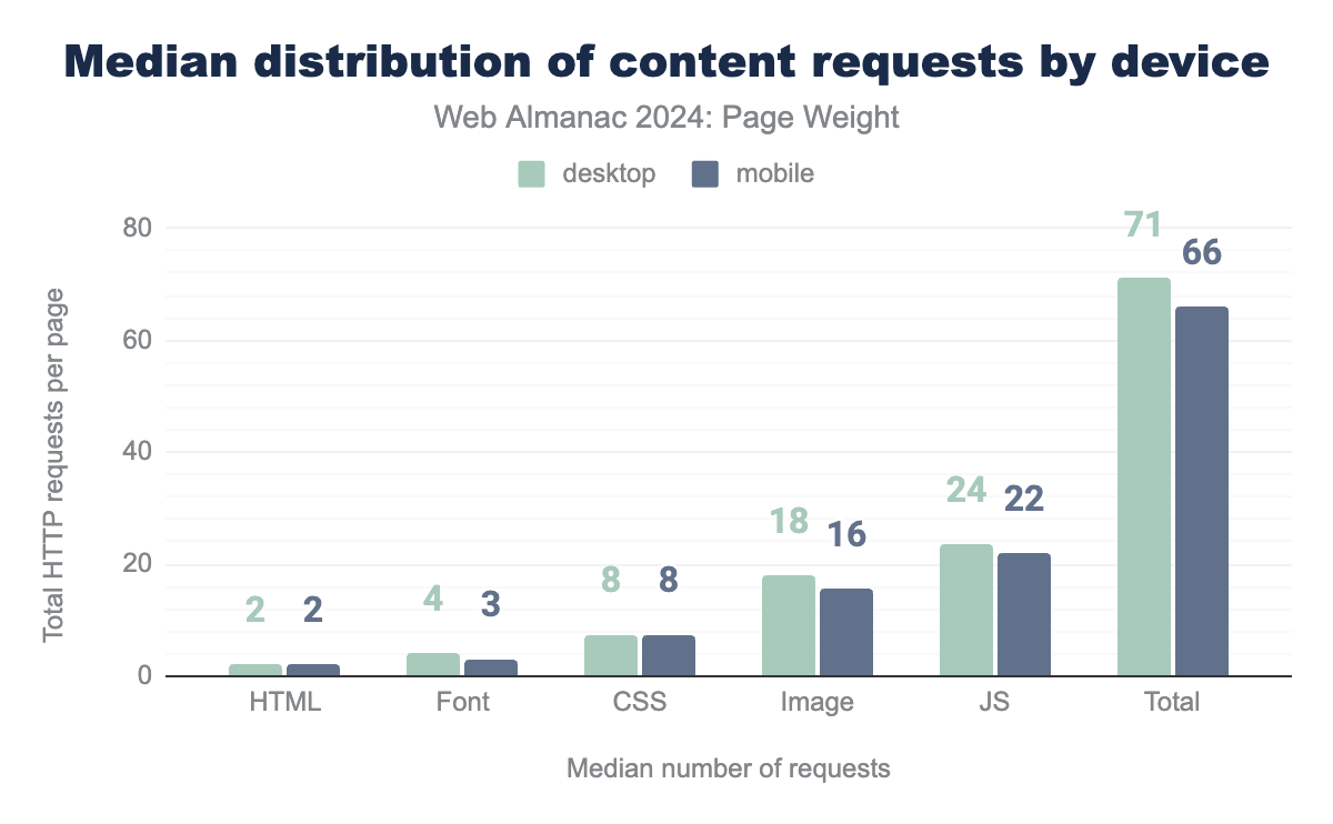
The total number of requests for desktop pages decreased by 9%, down to 71 from 2022’s 76 requests per page. Similarly, mobile decreased from 70 to 66 requests. The count of image file types decreased by 43% in 2024
Desktop pages requested 18 images in 2024 compared to 25 in 2022.
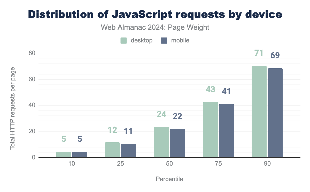
Javascript overtook images as the most requested file type. The median page requested 24 Javascript resources on desktop pages. Mobile saw 22 requests.
As we begin dissecting behavior patterns for page weight, it is important to note the impact of inner pages. Throughout this chapter, you will find strong variances that are only visible when homepages are compared to inner pages.
This is noteworthy as our new data will change device type comparisons due to the significant variances. With this in mind, we have also included comparisons filtered to homepages for a more accurate measure to 2022’s data set.
Requests volume
Each request a page makes is a component needed to create the intended experience and content it provides. The total number of requests, the number of pieces needed to complete the build, impacts page performance.
Modern browsers are multi-threaded and multi-process. This means they can utilize multiple threads and processes to handle different tasks, including network requests. Each request requires resources to execute, and due to their technical limitations, only a limited number of requests can be completed simultaneously. Like humans, browsers can only do a limited number of things at once.
With this knowledge, the number of requests impacts both page weight and perceived performance.
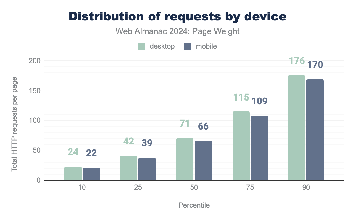
The median page makes 71 requests on desktop and 66 on mobile. These numbers include both home and inner pages. When compared to the 2022 distribution, all percentiles show a decrease in the total number of files.
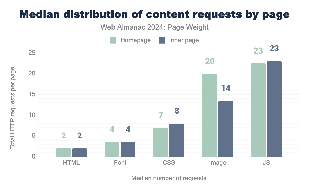
The lower all over numbers are impacted by the consistently lower number of requests made by inner pages when compared to homepages. The median homepage calls 72 resources while its inner counterpart requires only 65.
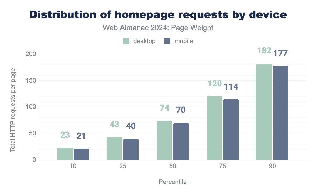
When analyzing only homepages for data congruity, total requests were slightly down in 2024 but consistent with 2022 rates. The median desktop homepage requested 76 resources in 2022 and now requests 74. The mobile median remains unchanged.
Images
Images are static files that are essential for constructing and displaying web pages. As the web becomes increasingly visual, they exemplify the need to balance performance-enhancing technologies with asset byte size.
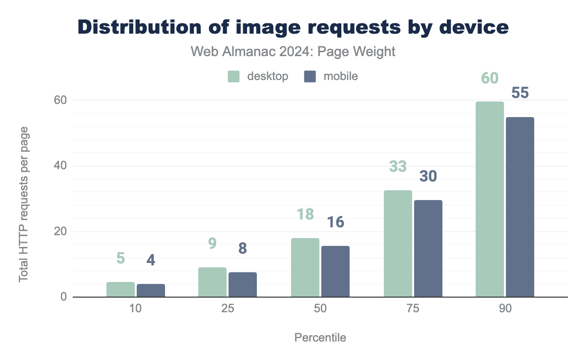
In 2022, we saw the median page request 25 images for desktop and 22 for mobile pages. This is down to 18 for desktop and 16 for mobile.
Decreased image file types does not mean that the web has become less visual. Instead, sites may be switching to CSS effects (such as shadows or gradients) and CSS animations. These assets can be used to produce resolution-independent assets that always look sharp at every resolution and zoom level, often at a fraction of the bytes required by an image file.
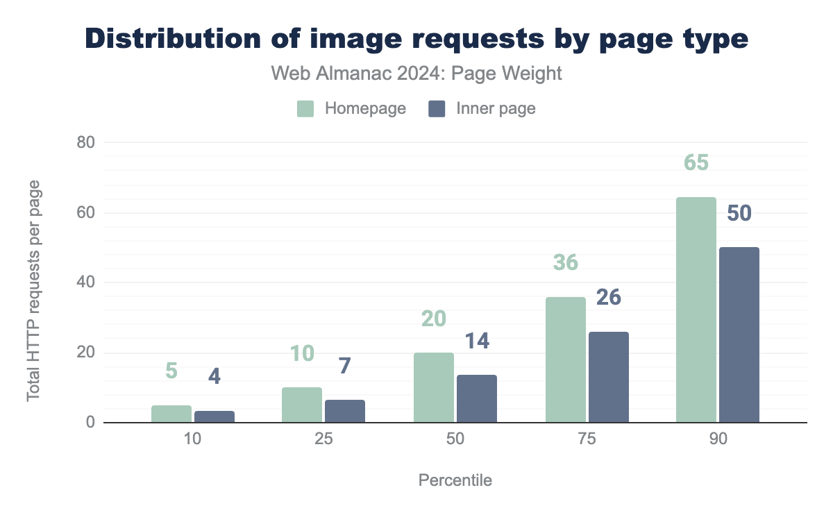
Desktop pages consistently call for more image file types with the gap between desktop and mobile growing steadily and consistently across percentiles. The difference between homepage and inner pages was striking in comparison. Where device type saw relatively consistent numbers, the median homepage called for 20 images compared to just 14 for inner pages.
CSS
CSS, or Cascading Style Sheets, is a style sheet language used to describe the presentation of a document written in a markup language like HTML. In other words, CSS is responsible for the visual styling and layout of web pages.
It allows developers to control the color, font, size, spacing, and many other visual aspects of HTML elements. CSS works in conjunction with HTML, providing a separation of content and presentation.
This separation makes web pages more maintainable, flexible, responsive, and can be used to make a site more performant but substituting byte-heavy image assets with CSS effects and animations.
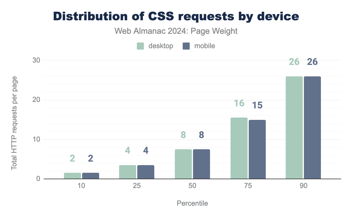
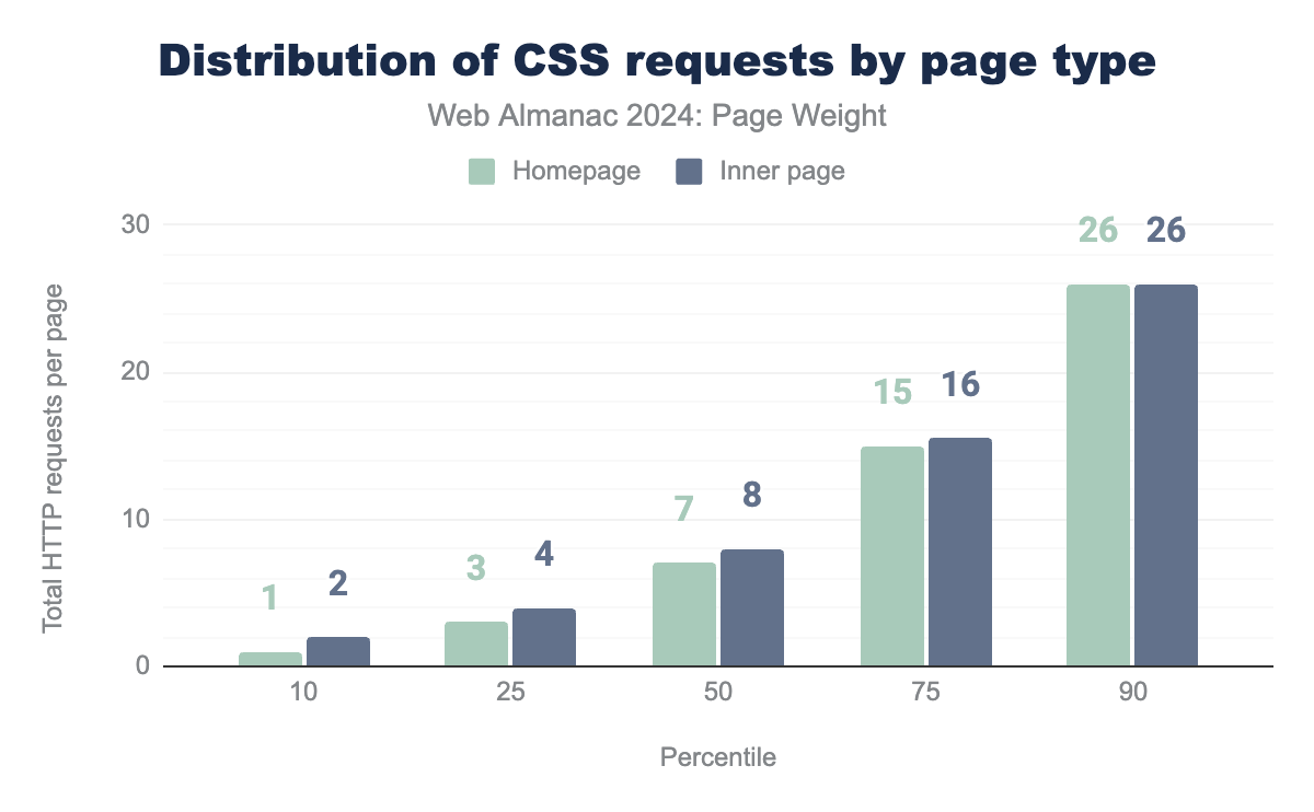
CSS is an essential tool in the web developer’s toolkit across devices and page types. The median desktop and mobile page both called for 8 CSS assets. Percentiles were identical except for a nominal variance at the 75th.
In comparing homepages to inner pages, we saw that homepages consistently called one fewer cascading style sheets until the 90th percentile. At the 100th percentile, we saw inner pages deviate with a spike of 4,879 requests compared to 3,346 on inner pages. While both are high, inner pages are 46% higher.
JavaScript
JavaScript is a high-level, dynamic and interpreted programming language. It is one of the core technologies of the web, enabling interactive web pages and web applications. JavaScript allows developers to add interactivity, animations, and effects to web pages. This includes features such as drop-down menus, image sliders, personalized content, and analytics tracking.
It is used as a client-side programming language by 97.8% of all mobile home pages, and 98.5% of inner pages.
2024 saw JavaScript overtake images as the dominant file type. The median page requested 24 JS files for desktop and 22 for mobile pages. This is up 8% for desktop and 4.5% for mobile when compared to 2022. The number of JavaScript requests was consistent between inner and homepages through the 90th percentile.
At the 100th percentile, desktop pages and homepages broke away from their counterparts in the number of requests. Desktop pages made 33% more requests; homepages made 31% more. Desktop homepages made requests for 12,676 JavaScript resources. We attempted to reach the page for comment, but the request was still loading at time of publication.
For more information on how JavaScript is being used in 2024, take a look at the JavaScript chapter.
Third-party services
Third-party resources are external assets or services that are integrated into a web page or application, but are hosted and maintained by a different provider. These resources can include things like JavaScript, CSS, fonts, and analytics tools, to name a few. According to the Third Parties chapter, 92% of pages had one or more third party resources. The most called third party resources were scripts, making up 30.5% of requests by content type. The authors also noted a considerable decrease in the number of third parties for lower-ranked websites.
For more insights, refer to the Third Parties chapter.
Other assets
Web pages can utilize a variety of other assets and resources beyond just code, styles, and images. These additional assets contribute to the overall functionality, interactivity, and visual appeal of a web page, working in harmony with the HTML, CSS, and JavaScript to create a complete user experience.
HTML
HTML, or Hypertext Markup Language, is the standard markup language used to create and structure web pages. It provides the foundation for the content and layout of websites, defining elements like headings, paragraphs, lists, links, images, and more. HTML uses a series of tags and attributes to describe the semantic meaning and visual presentation of web page content.
There are several reasons why a page may include more than one HTML request for a single web page, including:
- Embedded Resources: A web page typically loads not just the HTML document, but also additional resources like images, CSS files, JavaScript files, fonts, etc. Each of these external resources will trigger a separate HTTP request to the server to fetch that content.
- Dynamically Loaded Content: Some web pages use JavaScript to dynamically load additional content or data after the initial page load. This could be things like infinite scrolling, AJAX-powered content updates, or lazy-loading of elements. These dynamic requests are in addition to the initial HTML document request.
- Preloading/Prefetching: Web developers may include
<link>tags withrel="preload"orrel="prefetch"to instruct the browser to proactively fetch certain resources in advance before they are actually needed. This can improve perceived performance. - Error Handling: If there are any network errors or server issues when loading a resource, the browser will retry the request, leading to multiple requests for the same content.
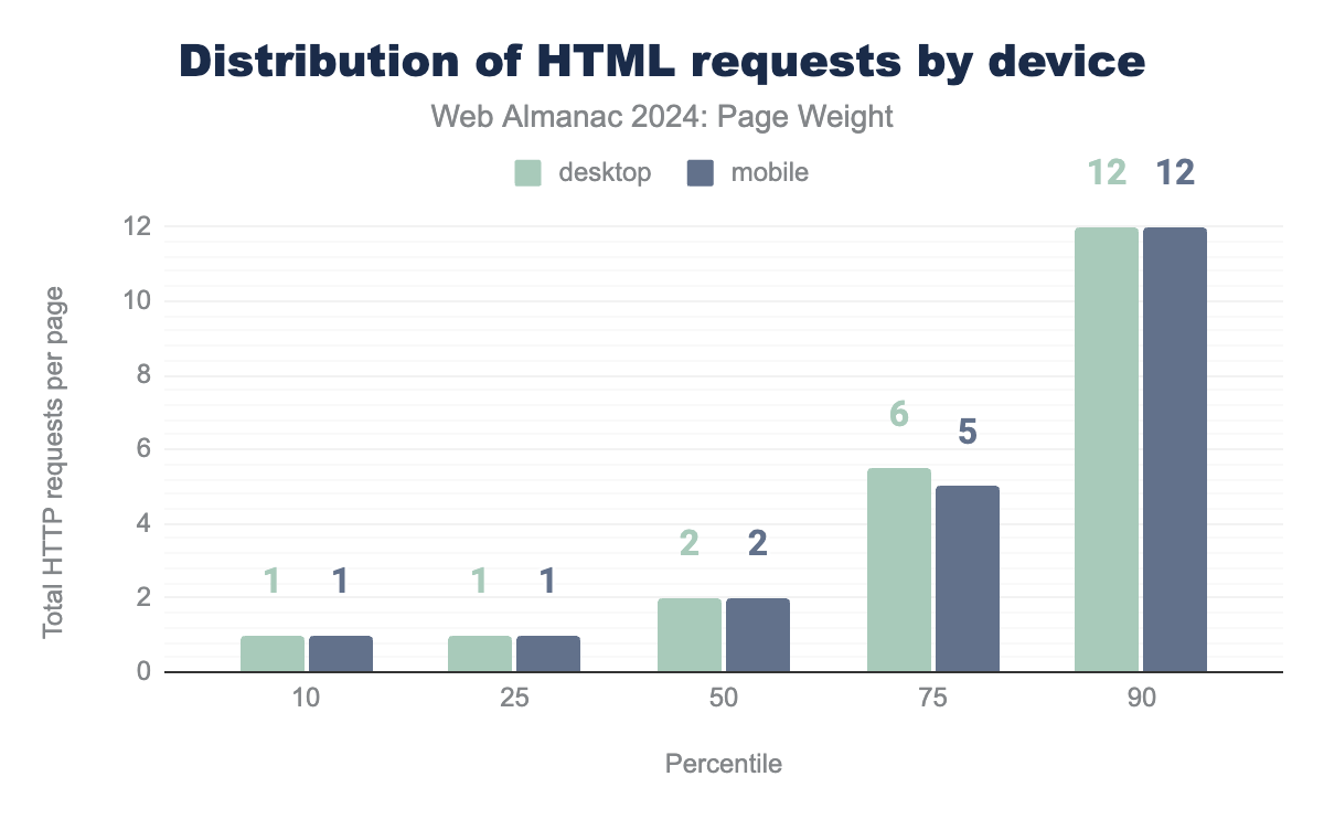
The median page made two HTML requests., which was consistent across devices and page types. At the 90th percentile, we saw 12 HTML requests. The number spiked dramatically at the 100th percentile, where desktop homepages made 13,389 requests.
Fonts
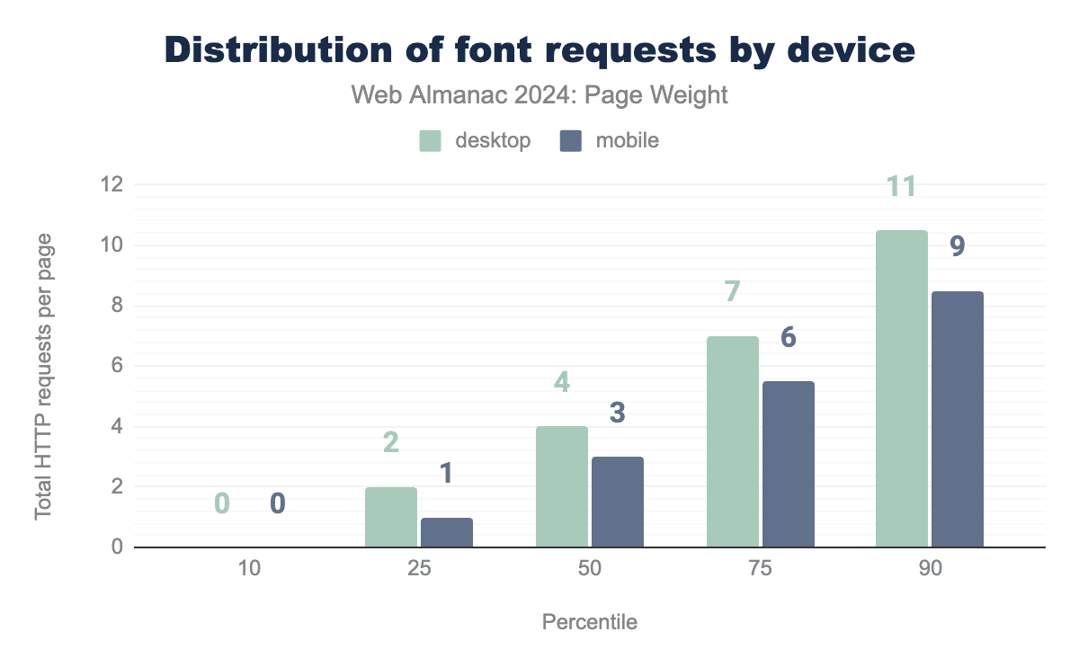
The median page requested four font files. Through the 90th percentile, font requests remained fairly low and consistent across device and page types. At the 100th percentile, we saw desktop homepages request 3,038 fonts. With that volume of font requests, we speculate this site to be a font repository or a ransom note generator.
Request bytes
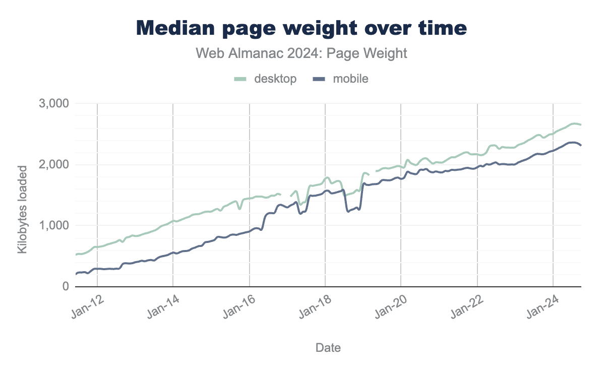
Comparing the median page weight over time shows that unfortunately it continues to grow, almost at the same rate. The median page weight is still increasing at almost the same rate, as shown by a comparison over time.
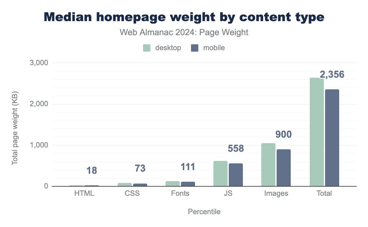
The median page weight for a desktop page, as measured in October 2024 is 2,652 KB, for mobile it’s a slightly lower, but still weighty 2,311 KB.
Compared to 2022’s chapter, both figures are higher, with the median desktop page being 2,312 KB and for mobile it was 2,037 KB. 2024’s Mobile page is just 1 KB lighter than 2022’s desktop page. In October 2024, the median page weight for a desktop page was 2,652 KB, while the median page weight for a mobile page was 2,311 KB.
Both of these figures are higher than those from 2022. In 2022, the median page weight for a desktop page was 2,312 KB, and the median page weight for a mobile page was 2,037 KB. Notably, 2024’s mobile page weight is only 1 KB lighter than 2022’s desktop page weight.
When we compare year to year, desktop grew 8.6%, or 210 KB from Oct 2023 to Oct 2024, and mobile grew 6.4%, or 140 KB.
The median desktop page has increased by 120%, or 1.4 MB, over the past 10 years. The median mobile page has seen a more significant increase of 357%, or 1.8 MB, during the same period. This equates to adding more than a 3.5” floppy disk’s worth of data to mobile pages.
Year-over-year, from October 2023 to October 2024, the desktop grew by 8.6%, or 210 KB, and mobile grew by 6.4%, or 140 KB.
According to What Does My Site Cost? a web based tool for calculating the cost of web data to end users, the median desktop page could cost a user up to $0.32 USD, or in some regions up to 1.7% of their Gross National Income.
Content type and file formats
The predominant resource type for homepages, excluding video, is images. The median desktop page using images requests 1,054 KB, while mobile pages request 900 KB. This shows a small increase from 2022, where desktop pages requested 1,026 KB and mobile pages requested 900 KB.
JavaScript was the second largest contributor to page weight, with the median desktop page serving 613 KB, on mobile pages it’s 558 KB. Like images, these both represent growth from 2022’s chapter, where it was 509 KB on desktop pages and 461 KB on mobile pages.
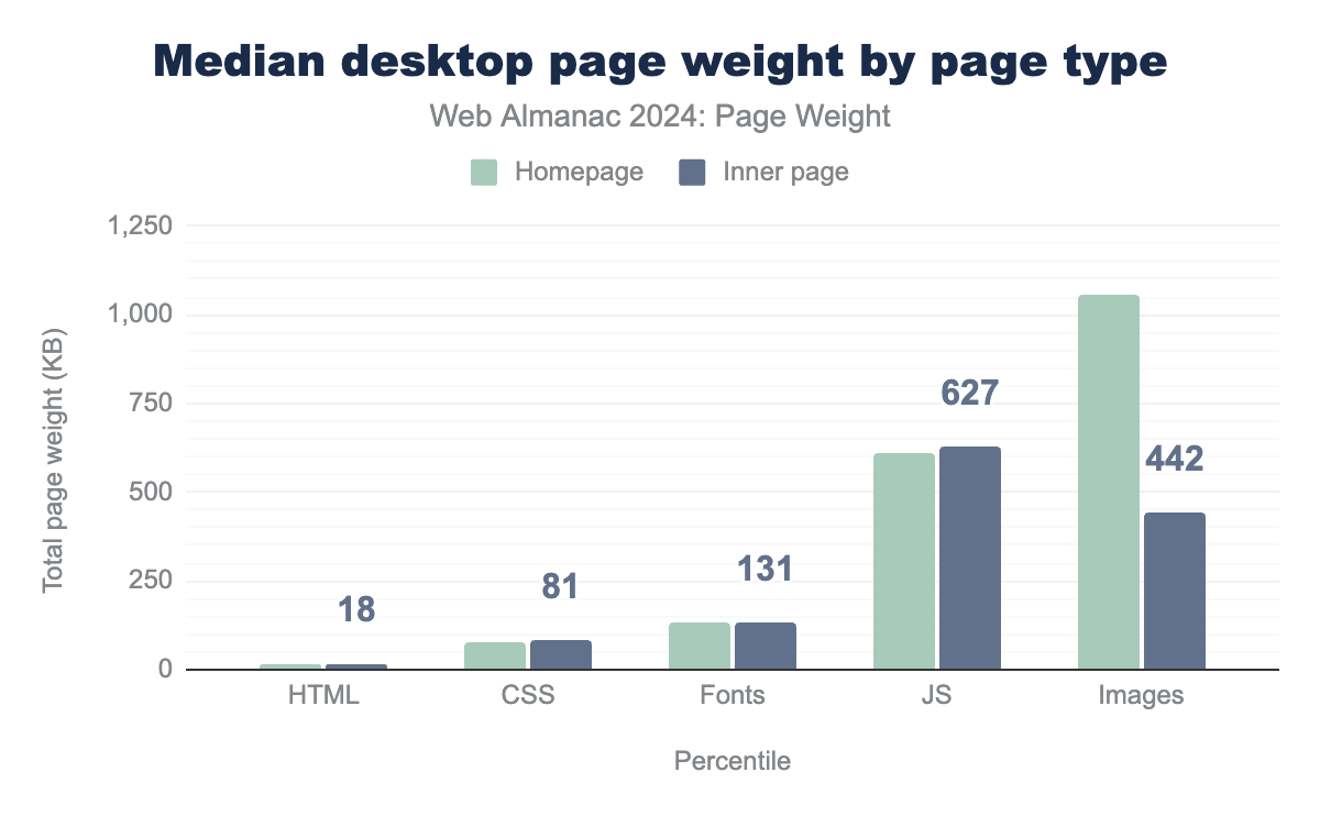
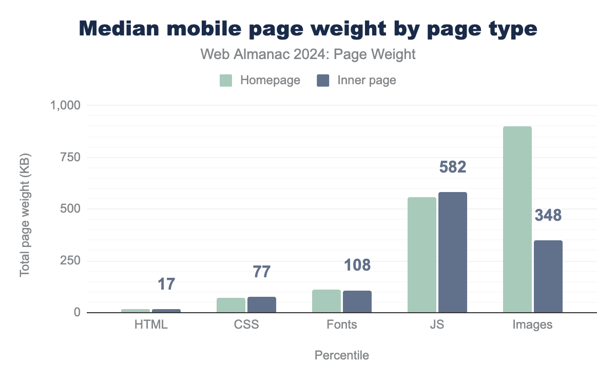
For both mobile and desktop pages, inner pages tend to have less bytes of images, and slightly more bytes of JavaScript.
This new analysis also shows that images are not always the biggest component of page weight, as previously thought, and that for inner pages JavaScript took that dubious honor instead.
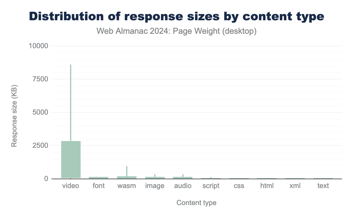
Images might be the biggest contributors to page weight in all in all, however when looking at the size per request, that switches to Video leading the way, followed by fonts, and WebAssembly (wasm) files (which weren’t detected in 2022). In 2022’s analysis, audio was the second most weighty, but it slipped to fourth place, behind images this year.
JavaScript Bytes
Increased weight of JavaScript files carries an additional penalty to performance, as not only is the pure size a consideration, a browser needs to parse and execute the JavaScript, which can be a costly process, especially on lower-end devices.
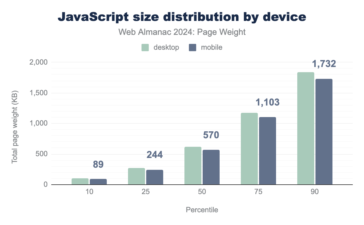
Although the trend is that a desktop page requests more bytes of JavaScript than a mobile page, with the median desktop page requesting 620 KB of JavaScript, and a mobile one 570 KB, the differences aren’t huge.
According to Alex Russell’s The Performance Inequality Gap, 2024 study, these are however far above the proposed target of a page load of under 3 seconds at the 75th percentile, which is 365 KB.
At the 75th percentile, both mobile and desktop blast past the proposed 650 KB budget to achieve a 5 second load time, and that is assuming it’s a JavaScript-heavy page, and markup is accordingly smaller.
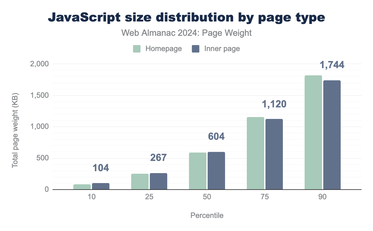
There is not a huge difference between homepage and inner page JavaScript file response sizes. Inner pages have a little more JavaScript up to the 50th percentile, above that the trend is for homepages to have more.
This could point to there being opportunities for developers loading all, or most, JavaScript resources on all pages and represent an opportunity to reduce JavaScript needed overall by tree shaking, which is a method of splitting JavaScript files up into more specific ones and only loading them when needed, therefore reducing the wasted JavaScript bytes being downloaded.
CSS bytes
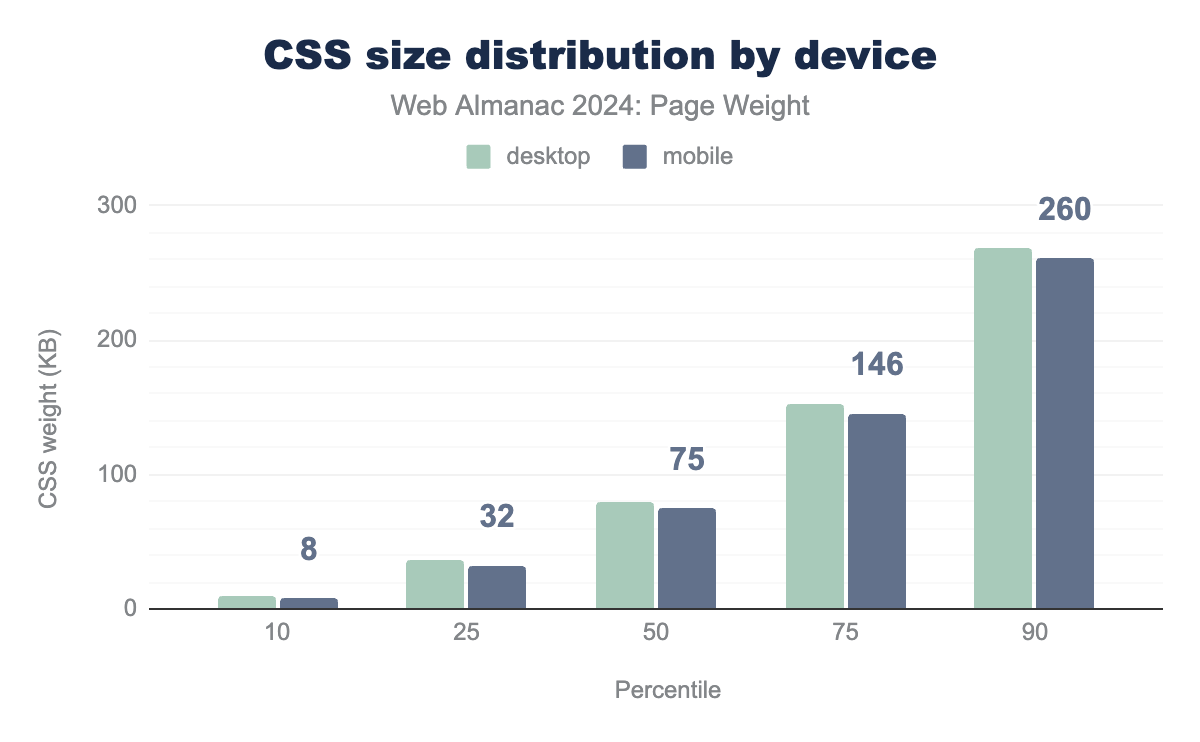
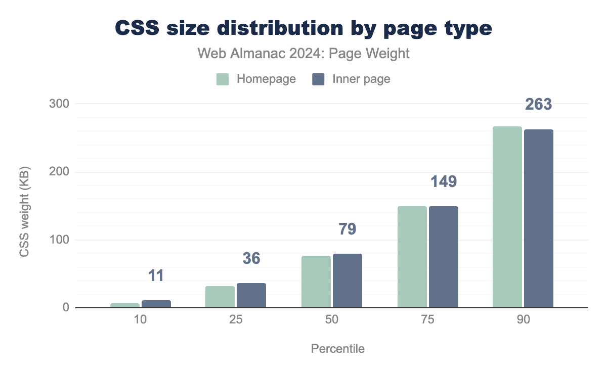
CSS sizes were slightly larger on desktop than on mobile across all percentiles, and there was very little difference between homepages and inner pages.
This points to the generally adopted method is one set of CSS for all devices and page types. This does potentially point to a missed opportunity to reduce CSS needed overall by tree shaking, as with JavaScript above, but it’s always a more nuanced thing with CSS where you are balancing caching and the capabilities of build tools.
Overall, the 76KB of CSS files seems both a little larger than you would hope, but not excessively huge, but keep in mind the best size for a CSS file is as small as it can possibly be. Hopefully that doesn’t mean folks are just stuffing it all inline in the head instead.
Image bytes
In past page weight chapters, images have always been the largest contributor to page weight overall, and even though 2024’s new inner page data shows that’s a trend specific to homepages, it still represents a large component overall.
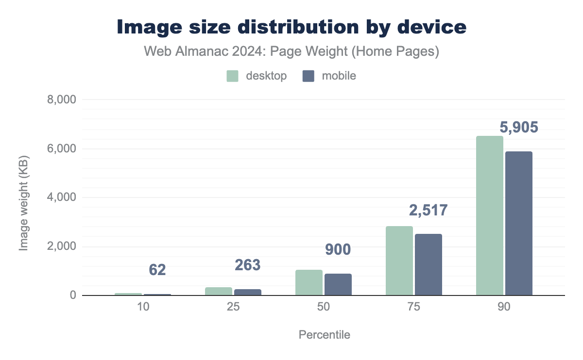
The median desktop homepage is loading 1,054 KB of images, and mobile ones a little less weighty 900 KB. As noted earlier that’s still an increase over 2022 where it was 1,026 KB for desktop pages, 900 KB for mobile. Things soon balloon once you get to the 75th percentile, with 2,822 KB of images for desktop, and 2,517 KB of images for mobile.
In fact, at the median and above, all percentiles were bigger than in 2022 chapter, however the more positive findings are that at the 10th and 25th, image bytes were either pretty much stable or down from the previous chapter, pointing to the fact that developers who were already optimising for image file sizes have continued to do so, and might be getting slightly better at it.
It is also pleasing to see that where developers seem to be concentrating on reducing the impact on page weight the most is for mobile users, where page weight can carry the highest penalties. This could be due to folks using responsive image serving.
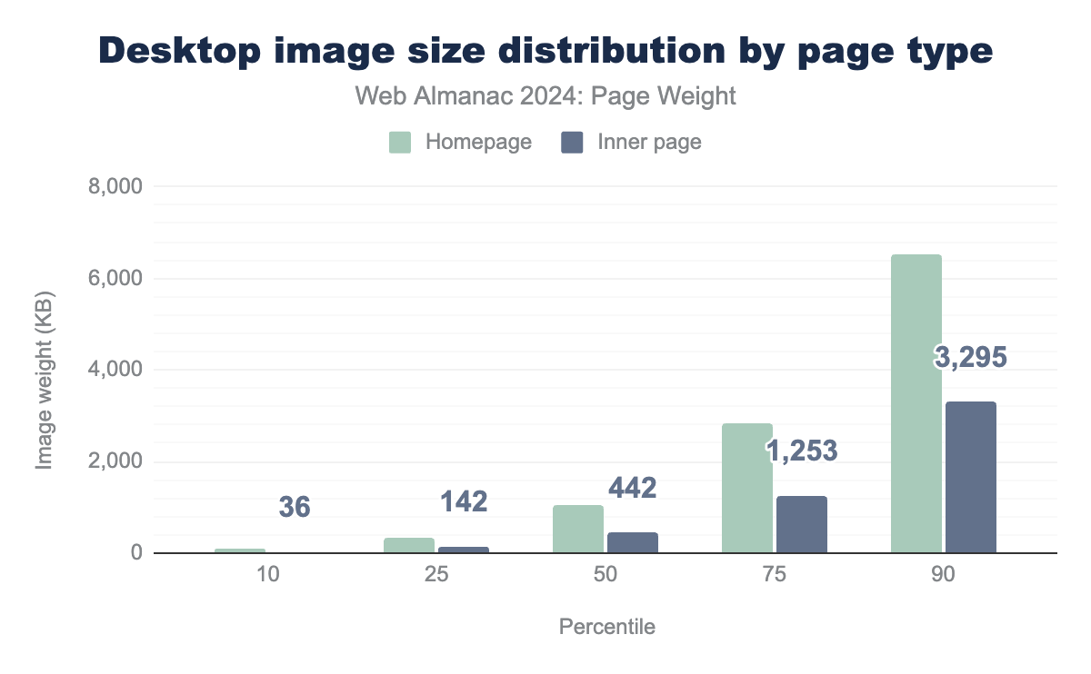
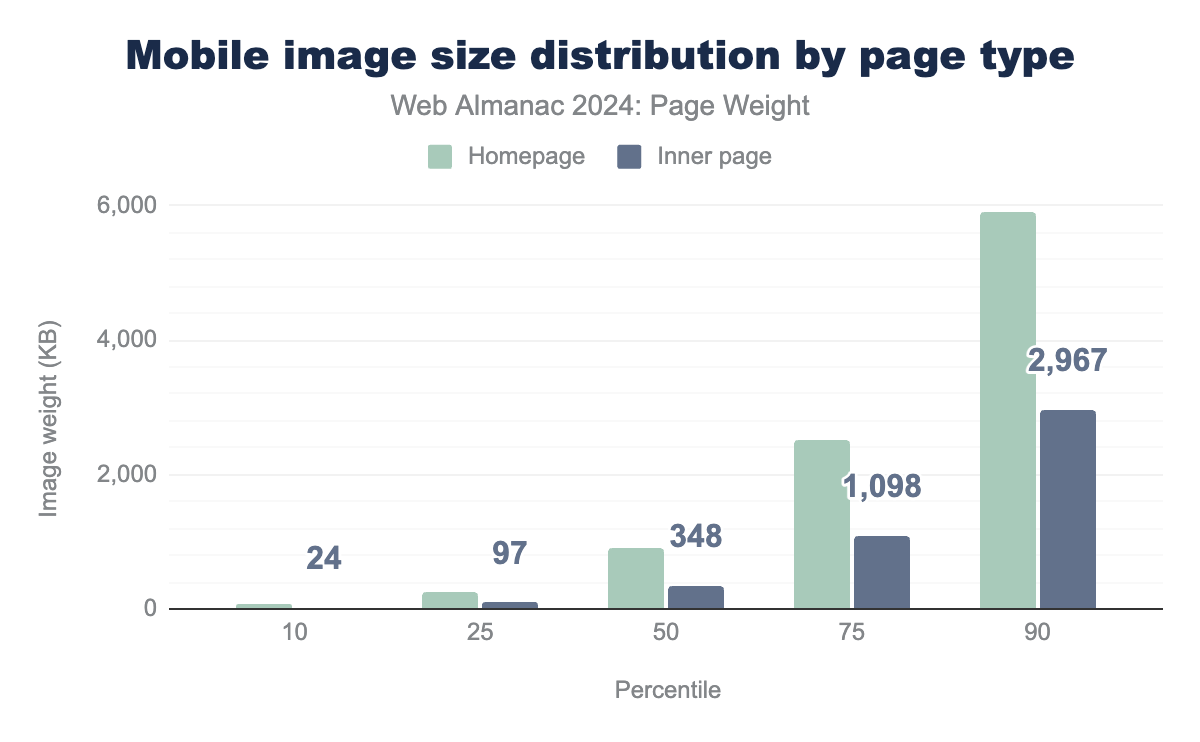
Looking at home and inner pages, there is a clear trend for both desktop and mobile for the homepage to have more image bytes, with the median desktop page having 1,054 KB for homepages and 442 KB for inner pages, and on mobile it is 900 KB for homepages and 348 KB. For both desktop and mobile the median inner page carries less than half the image bytes than the homepage.
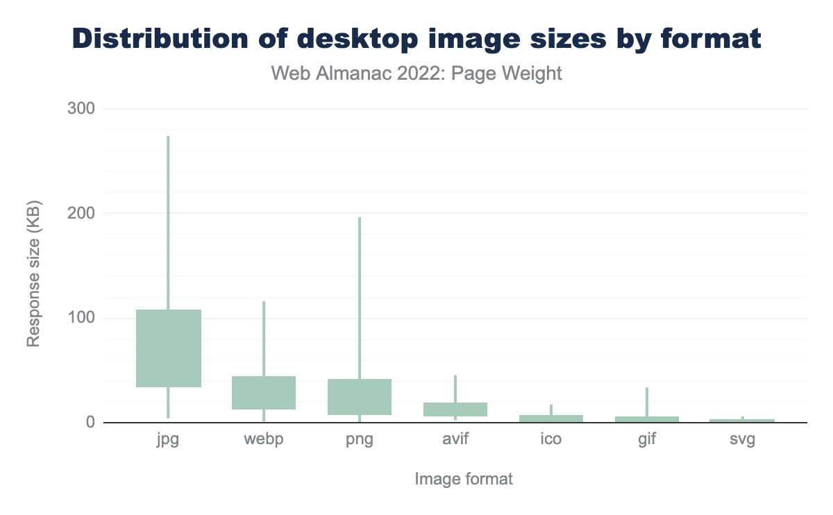
JPG, WebP, and PNG file formats retain their 2022 status as top sources of image weight, for more insights into image format use on the web, visit the Media chapter.
Video bytes
Videos carry a lot of data, for each second of video, there’s many images, or frames, and often audio as well. As such, they can significantly add to the weight of a page.
Modern formats help compress and shrink this down, but at some point there is a trade off to be made with file size and quality.
Getting that trade off right and combining with other techniques, like using a facade, can reduce the impact as much as possible.
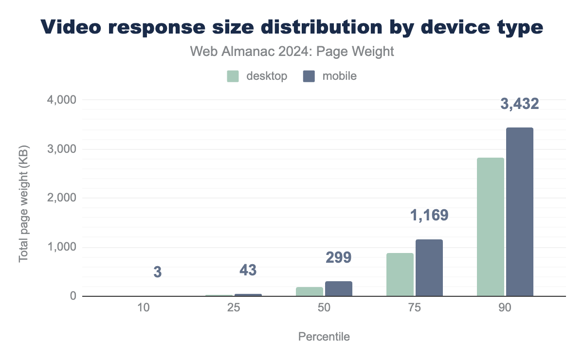
The median page requests 194 KB of video for desktop users, and surprisingly a larger 299 KB for mobile users. In fact that trend was present from the 25th percentile onwards, which is a disappointing trend, given that mobile devices are likely to be the ones to benefit the most from reduced page weight.
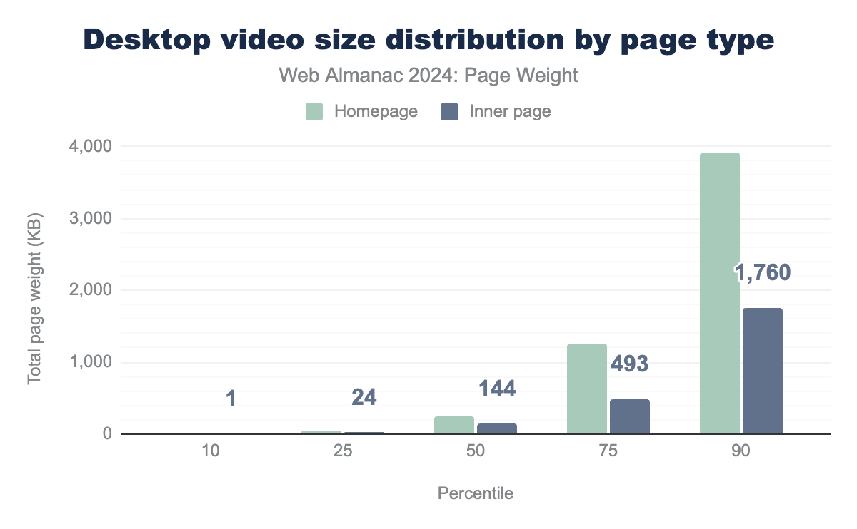
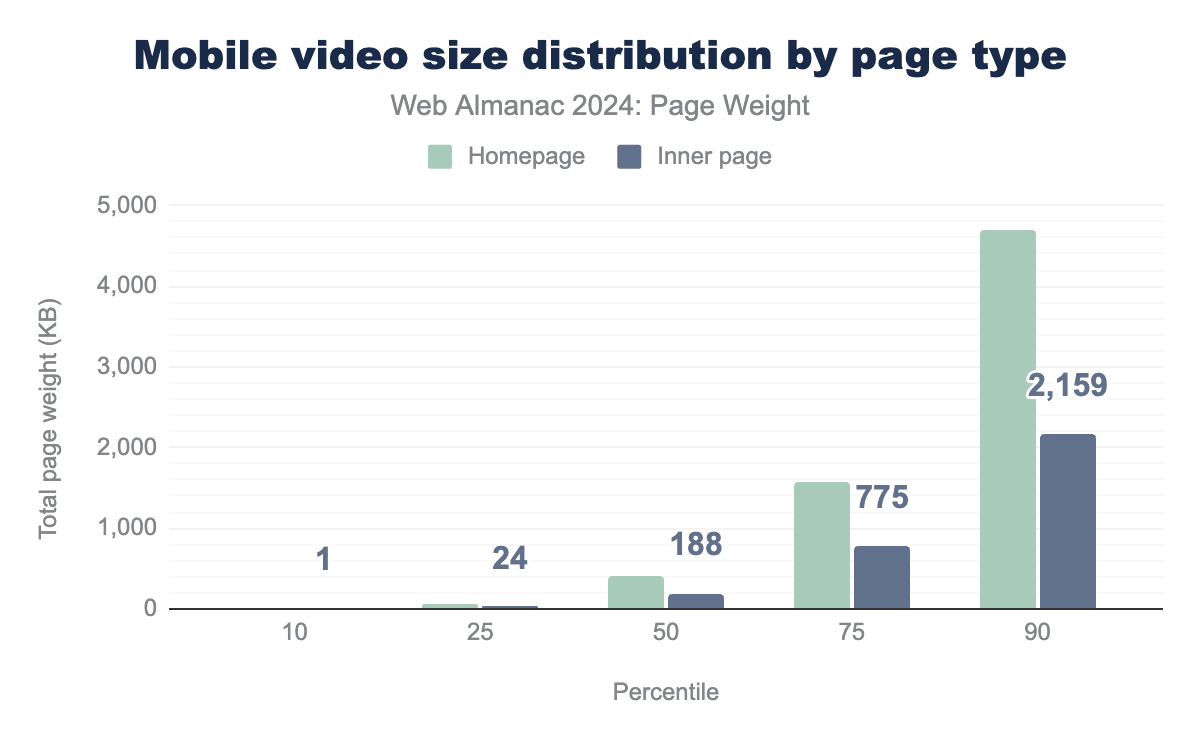
Homepages are found to have a larger payload of video resources than inner pages, with the median homepage requesting 243 KB of video resources for desktops and 410 KB for mobile devices. Inner pages were lower at 144 KB for desktop and 188 KB for mobile devices.
This could point to developers favour using video “hero” sections, or otherwise embedding video on homepages, which tend to focus on the site or business as a whole, rather than adding them into inner pages, which are likely to be more focused pages, perhaps categories and listing pages, or individual articles or products.
Adoption rates of byte-saving technologies
There are a number of things that can be done to reduce page weight. The first one is not so much a technology as an approach, and is on the surface quite simple. Don’t send stuff you don’t need to.
This means that you should be mindful of what is added to pages, and what is shipped, in short you should be looking to see if what you are adding is really adding value to the user of the page and the business case the page might need to fulfill.
But the aim isn’t to remove all features, rather, make sure that what you are adding adds value.
Let’s take a look at some of these patterns and approaches to help you deliver your valuable content in more efficient ways, and how often they are being implemented.
Facades for videos & other embeds
Third-party embeds, such as videos, social media posts and other interactive embeds can massively increase page weight. It’s simple to click that share button on a video or post and paste the code into your pages without fully being aware of the huge payloads that can come along with it.
Videos you might expect to have a significant number of bytes, but even things like embedding a live chat widget, or even a social media post like a tweet can come with significant overhead, loading a surprising amount of JavaScript to enable interactivity, like clicking the like button or resharing it.
One design pattern that can be a good compromise is using a facade, also known as import on interaction. The fundamental principle of this is to use a graphical, or simple, non-interactive representation of the embed, which then becomes the interactive, full embed when and if a user clicks on it.
For video, that’s often displaying the poster image, which when clicked loads in the full embed. For a social media post, it could be either styled html, or like the video solution, an image that loads the full interactivity when the user clicks on the post.
Whilst ultimately, if a user interacts, the larger payload does still need to be loaded, the savings come when many users don’t want to interact, watch the video or start a live chat with customer services or sales. The users that do pay that cost are the ones that proactively want to use the feature.
There can be some drawbacks to using facades, these are covered well in the third-party facades article on web.dev. But ultimately, this approach can help save a significant amount of overall page weight.
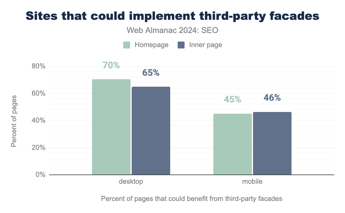
To look at adoption of facades, we can turn to Lighthouse, which offers a lazy load third-party resources with facades audit to see if there are some identifiable resources embedded in the page that might represent an opportunity to use a facade.
Judging adoption is, overall, hard, as we can’t reliably test for sites that are implementing facades, because the solution involves the page no longer loading the resources we’d be looking for, so looking at sites that could potentially benefit is more meaningful.
70% of desktop homepages were detected as having the opportunity to replace some embeds with facades, for inner pages on desktop it was 65%. For mobile crawls, things were better here, with 45% of mobile homepages potentially being able to benefit, and 46% of mobile inner pages.
From the data, it would appear that either adoption is higher on pages being served to mobile clients, or developers and publishers are omitting the type of third-party embeds for mobile users altogether.
Although facades were covered in the previous almanac page weight chapter in 2022, the test has changed slightly over the last two years, along with the methodology we used to analyze the data, so direct comparisons are not possible.
Compression
Compression can allow you to shrink the size of your resources before you send them across the network to the requesting client, where they are uncompressed by the client, which for web pages is usually a browser, before being used. Smaller payloads in theory, and usually in practice, make for faster page loads.
For text based files, like HTML, CSS, JavaScript, JSON, SVG, ico and ttf font files, HTTP compression is a powerful ally in reducing page weight as transmitted. Using GZIP or Brotli compression can sometimes significantly reduce the size of text-based resources. Other file types, especially media files like images and videos, do not benefit from HTTP compression, as they are already compressed.
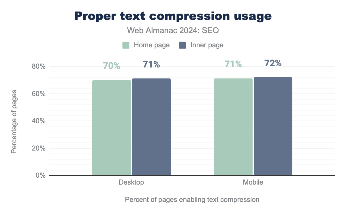
We detected that 70% percent of desktop homepages and a fundamentally similar 71% of inner pages correctly used text compression. The homepage figure represents a drop from 74% in 2022.
For mobile crawls, 71% of homepages and 72% of inner pages correctly used text compression. Comparing homepages to 2022, this also represents a drop from 73%.
The drop in usage, whilst perhaps small, is disappointing, it’s certainly not become harder to enable compression, and perhaps easier, especially if you use a CDN like Cloudflare where it’s a simple flip of a switch in a dashboard.
It should be noted that compression is not entirely magic, and doesn’t make the whole impact of page weight go away for these resources for the client. Ultimately they do need to be decompressed again before use.
It’s also not an entirely free process either, it takes work on the server to compress these resources, somewhat mitigateable by caching the compressed resources where possible, and it does take work on the client to decompress them too.
But as a tradeoff, it’s normally one worth making, compression techniques are generally well optimised and efficient, and the major bottleneck is the network.
Minification
Minification can reduce the overall size of resources by removing unnecessary characters, like spaces, returns and code comments, things that aren’t needed by a browser to use the resources.
Unlike compression, there’s no additional work to be done client side, resources do not need to be unminified. There can be some overhead and work done on the server, if resources are minified on-the-fly, but very often it’s best to minify CSS resources up front, they are very likely to be static in nature, and can often be done at build time.
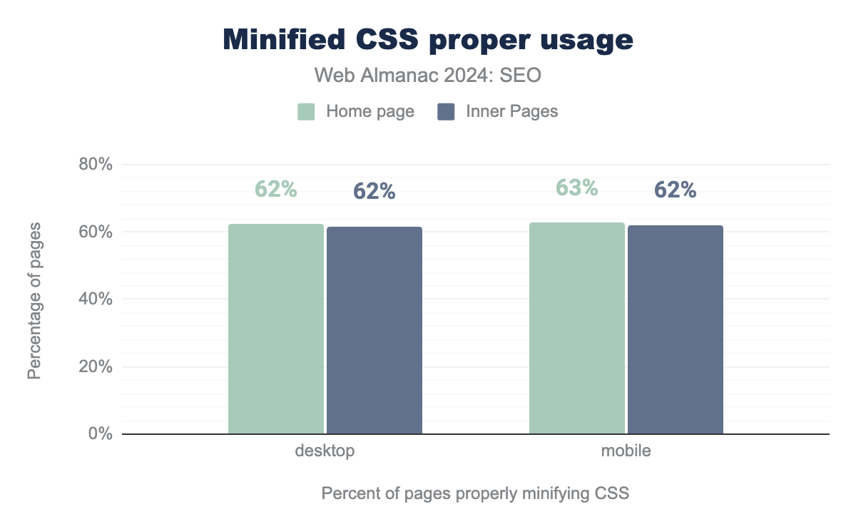
In 2024, 62% of homepages had correctly minified CSS, as detected by lighthouse, a significant drop from 2022 where the figure was 84%. For mobile homepages it was 63%, a drop from 2022’s 68%, and inner pages were slightly less at 62%.
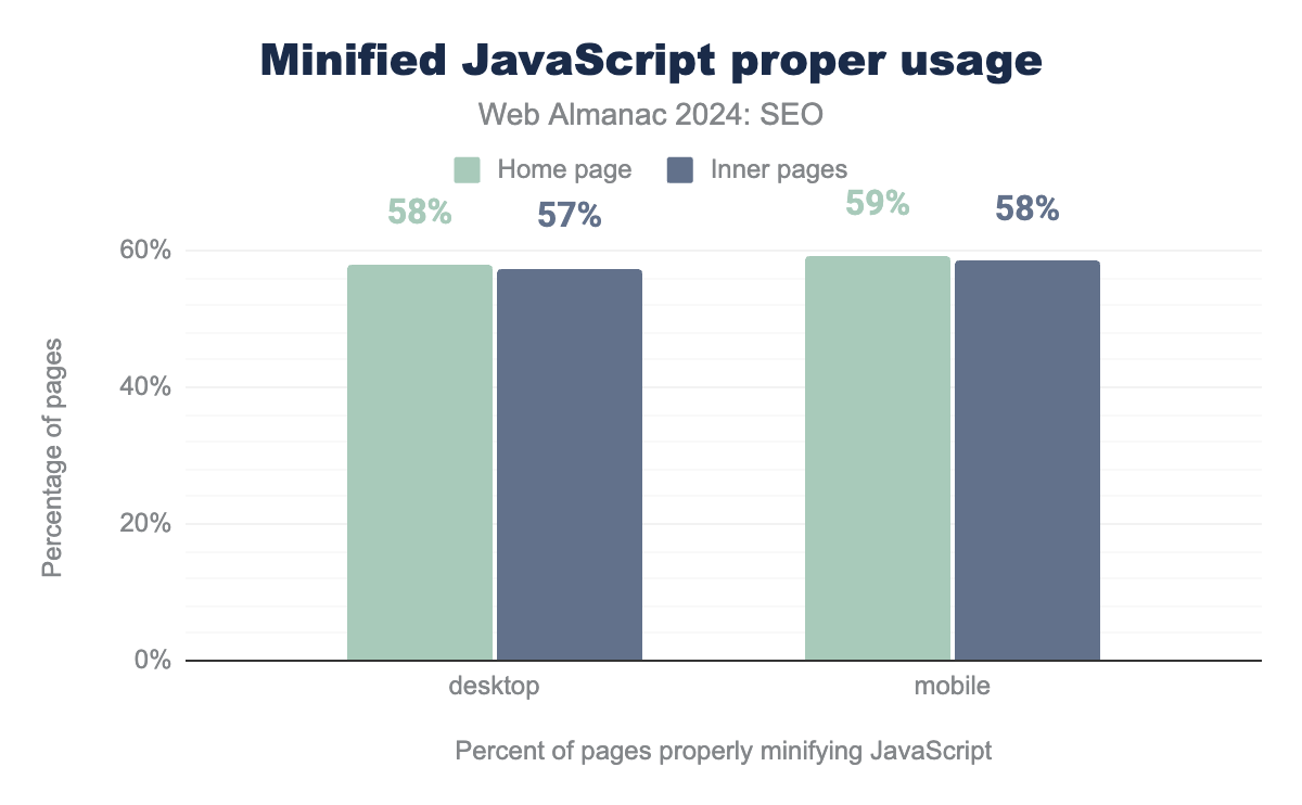
In 2024, 58% of desktop homepages had correctly minified JavaScript, as detected by Lighthouse, which is a significant drop from 2022 where it was 77%. Inner pages were slightly worse at 57%. For mobile, 59% of homepages passed this test, down from 2022’s 64%. Like desktop, inner pages were slightly worse at 58%.
Whilst it is still encouraging that more sites pass this test than don’t, it is very disappointing to see that both CSS and Javascript minification is less prevalent in 2024 than in 2022.
Caching and CDNs
The use of caching and CDNs plays a role in managing page weight, as they help reducing page load times by minimising the time required to deliver resources to users. However, it is worth mentioning that CDNs do not reduce page weight.
Resources include both static and dynamic, as well as personalisation, third-party integrations and Edge computing.
On the one hand, caches which are used both on servers and on browsers, allow resources to be reused. Cached content is sent via CDNs, a series of interconnected servers geographically distributed, which reduce the distance between the server requesting the resource and the resource being served. This is particularly important for international websites.
For more insights into CDNs, please refer to the CDN chapter.
Page weight and Core Web Vitals
Core Web Vitals are a set of performance metrics designed to refine the dangerously ambiguous definition of “performance” into a human-centric measurement. To be a “Good” page, a page must pass three evaluations that measure key moments for users:
- Is it loading? (Largest Content Paint (LCP))
- Can the user interact? (Interaction to Next Paint (INP))
- Is it visually stable? (Cumulative Layout Shift (CLS))
Core Web Vitals are designed to be an evolving set of metrics. This year, the metric for interactivity changed from First Input Delay (FID) to Interaction to Next Paint (INP). This change was made because it provided two significant advancements:
- The first is to shift from a single interaction to include all interactions on the page. In other words, clicking with a mouse, tapping on a device with a touchscreen and pressing a key on either a physical or onscreen keyboard.
- The second is to represent interactivity for sites using JavaScript frameworks accurately, since JavaScript is often what drives interactivity mostly.
When responsiveness as measured by INP is below 200 milliseconds, it is considered to be a good experience and pass the INP performance assessment. Total Blocking Time remains as the lab data equivalent and is for diagnostics when an INP issue is detected.
The changeover in March 2023 saw many JavaScript framework origins drop from passing Good classification. Sites using prominent frameworks like React, Next, Nuxt, and Vue were hit hardest. Sites adapted quickly and by September 2024, the number of passing origins exceeded when evaluated by INP exceeded the count when the FID metric was used.
To gather data, we had to rely on lighthouse’s lab testing audits, which capture LCP and CLS, but not the interaction based metrics of INP or FID. Lab testing does have drawbacks, and real user metrics should always be used to truly assess performance, as detailed in web.dev’s Why lab and field data can be different (and what to do about it).
We used data from June 2024, the page weights for each percentile and device type are as follows:
| Percentile | Desktop Page Weight | Mobile Page Weight |
|---|---|---|
| 10th | 549 KB | 471 KB |
| 25th | 1,138 KB | 995 KB |
| 50th | 2,157 KB | 1,938 KB |
| 75th | 4,169 KB | 3,766 KB |
| 90th | 8,375 KB | 7,680 KB |
Largest Contentful Paint (LCP)
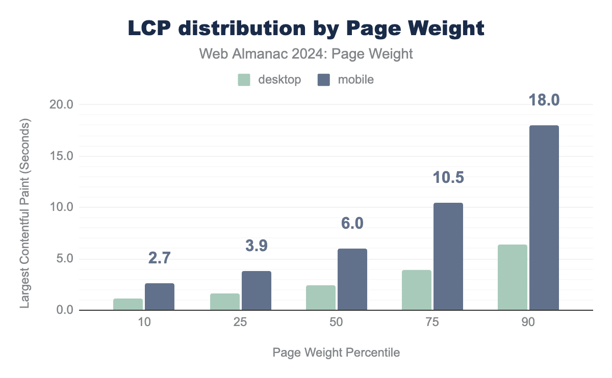
A good score for Largest Contentful Paint is 2.5 seconds or less. LCP over 4 seconds is considered poor.
There is a clear correlation between the page weight and Largest Contentful Paint, the higher the page weight, the longer the time to LCP. This is especially true for mobile devices with a much steeper curve.
Cumulative Layout Shift (CLS)
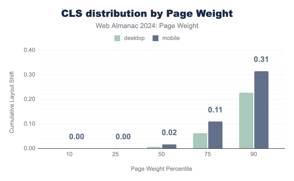
A good score for Cumulative Layout Shift is 0.1 or less. CLS over 0.25 is considered poor. On consideration to keep in mind when looking at this particular metric is it is especially affected by differences in lab and field data, as CLS is effectively measured across the whole life of a page, including interactions and scrolling, where lab tests can only capture the initial load.
Like LCP, CLS also grew as page weight grew, although the differences between desktop and mobile were more linear. CLS isn’t directly a load time issue, so this could point to poorly optimised, ads heavy pages injecting ads into content, pushing content down, or images with large files sizes defined without dimension.
Total Blocking Time
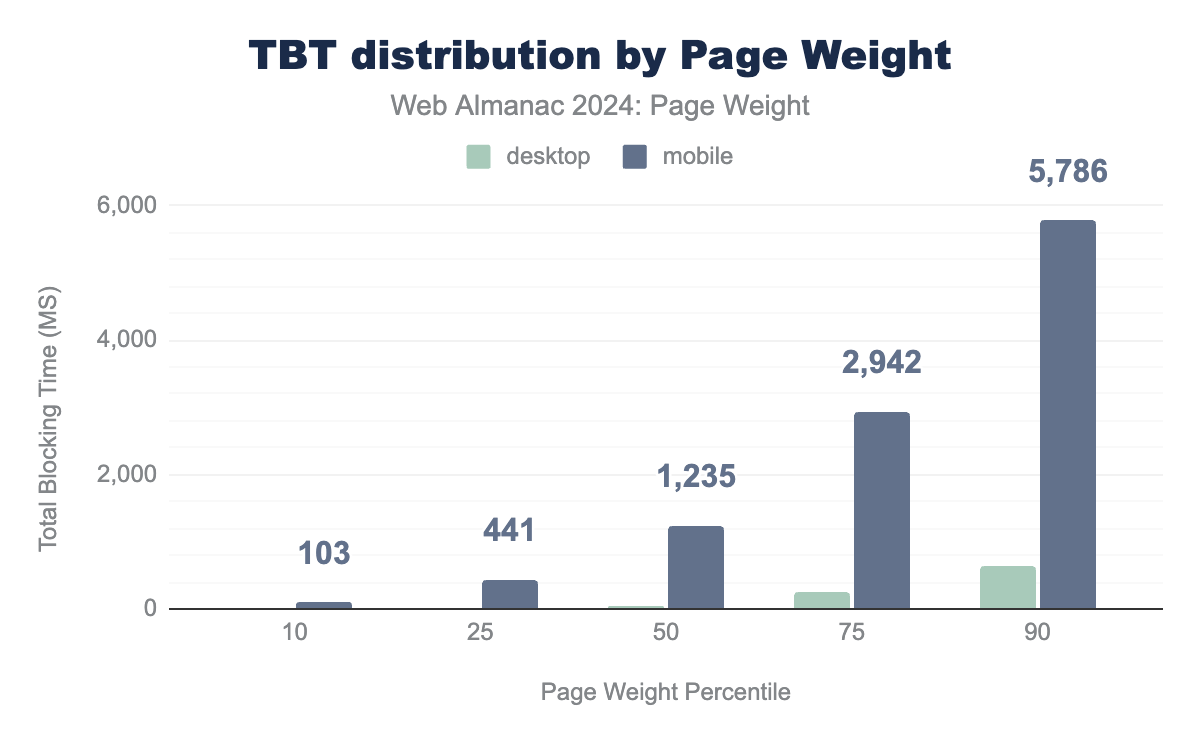
As mentioned above, Interaction to Next Paint, or even the older First Input Delay cannot be accurately measured in lab tests, however, as recommended by web.dev, Total Blocking Time, often shortened to TBT, can be a good proxy metric to see how interactivity might be affected.
A total blocking time of 200 ms or less is considered a good target.
The trend of larger page sizes negatively impacting performance, as measured by total blocking time, is evident across both mobile and desktop experiences. However, the disparity is particularly significant for mobile users. At the 50th percentile, Time to First Byte (TBT) is 53ms for desktop and 1,235ms for mobile—a difference of 1.2 seconds. This discrepancy becomes even more pronounced at the 90th percentile, with TBT at 648ms for desktop and a staggering 5,786ms for mobile—a massive 5.1 second difference.
It is reasonable to conclude that interactivity is one of the worst hit metrics associated with excessive page weight.
For more data on Core Web Vitals in 2024, visit the Performance chapter.
Conclusion
The growing issue of page weight reflects the need for balance between functionality and accessibility.
While advancements like JavaScript frameworks and rich media have enhanced the web’s interactivity and storytelling, they have also introduced significant challenges. Bloated pages disproportionately impact users with limited devices or slow connections, making web experiences less inclusive and equitable.
Sadly this year’s data shows the same trend of page weight continuing to increase, for both mobile and desktop users.
By focusing on lightweight, efficient design and adopting practices like compression, caching, and byte-saving technologies, developers can bridge the “performance inequality gap” and ensure the web remains accessible for all.
Ultimately, this approach not only benefits users but also supports sustainability and long-term growth of the web.
Overall, in 2024 page weight is far from a “solved problem”, but there remains a lot of opportunity for developers to embrace byte saving techniques and technologies, with plenty of room left for adoption for things like facades and compression, leading to a lighter, brighter web for us all.
